BILLABONG
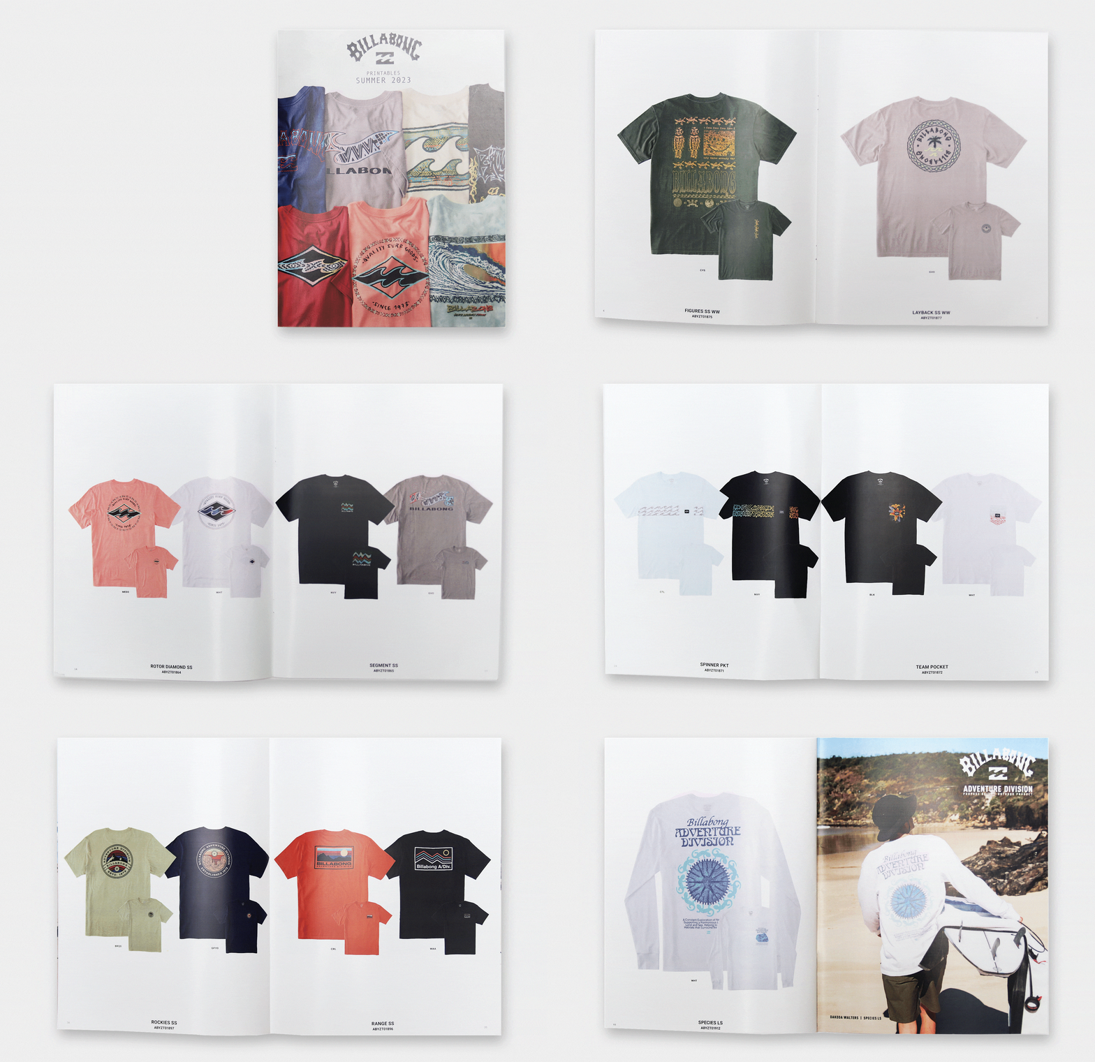
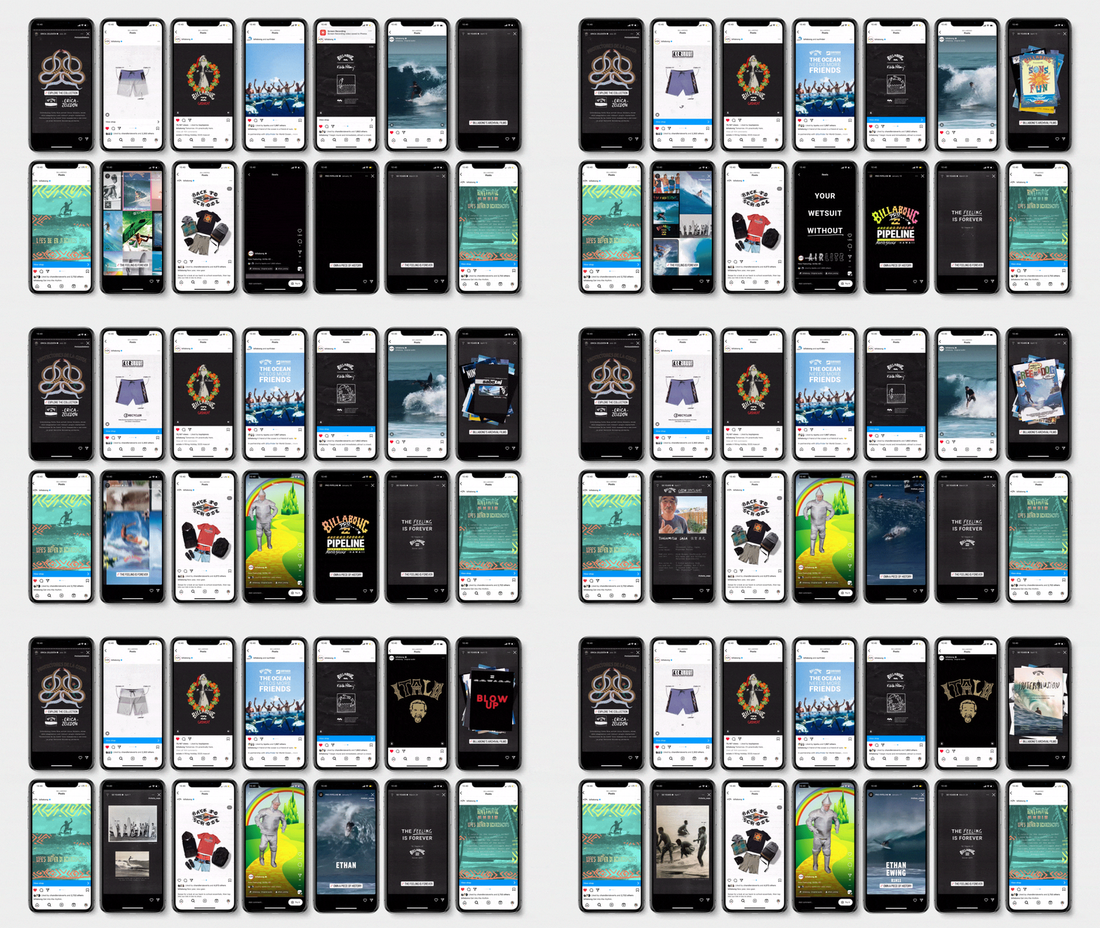
At Billabong I handled both print and digital work. Delivering on-brand brick and mortar solutions, including thoughtful window design and engaging point of purchase assets which assisted sales associates. I also worked with Billabong Sales representatives to develop a specialized graphic tee sales tool for each season. Which addressed a major painpoint they had with conventional catalog layout. I also supported our digital team with motion design for social media, web and email campaigns. I was lucky enough to be apart of a small group that executed Billabongs 50th yr campaign, as well as apply branding for globally broadcasted events including the coveted Pipe Masters.s. Below you can see various windows, logos, event posters, t-shirts and motion design.
Challenge
For years Billabong sales representatives struggled to get tee graphics visible within their complete seasonal catalogs. They were much to small and seasonal catalogs were bloated with many pages dedicated to thematic detailing as well as technical background information. The tee art was displayed so small that shop owners would rely on descriptions or needing to see samples to make their buys. Billabong has an incredibly talented team of illustrators and product designers creating beautiful tee graphics. Wholesale accounts needed a more consise, clear way to view our product teams hard work.
Solution
Enter the tee catalog, I was able to work with sales representatives to develop a tee only catalog that showcased these great graphics with 0 filler. With approval from our VP of Creative I was able to remove all technical detailing of the garments, revealing a cleaner page layout that allowed tee graphics to be x5 their previous sizes. I also changed overall page dimensions to better fit the height of the tees. I like to think I added through reduction making for a minimal, clean page layout. Only leaving needed information for orders has lead to positive feedback from reps and Billabong’s Vice President of Sales. I have made a tee catalog for every seasons since the inception.

Challenge
Develop energetic, youthful and engaging branding for Billabong’s 2023 Back to School campaign. The look and feel of the campaign had to appeal to surf and skate “rats” local beach groms that think radically even at their young age. The logo would be put across DTC assets like email, social ads, and web banners. Aswell as print assets like table signage for instore displays and large shop vinyl window banners.
Solution
Sketching out various New Year New Gear & Back To School’s quickly lead to adding flames everywhere. Inspired by my own history of drawing flames on boards and books throughout my adolescence I believe it added authenticity and the DIY aesthetic Billabong requested. I then paired the hand-drawn type with a retro logo. By pulling from Billabong’s logo archives I used an 80’s “diamond wave icon” because it would be fresh to the kids eyes but ring a bell for their parents that were the ones actually going to buy the gear. In the final assets, lined paper, chalk dust, and tape were added to visual language in order to accentuate the Back to School message.
Challenge
Create unique motion pieces to set Billabong apart from other surf brands. Highlight product flat lays, new fabrications / technology and special collaboration launches. Provide captivating GIFs for a diverse set of platforms and campaigns with the goal to increase email click through and drive social uses to Billabong.com
Solution
I was able to support Billabong’s social and ecom teams with motion design for social media, web and email campaigns. Adding motion to digital assets is an essential part to modern marketing and I’m stoked with the wide range of pieces I was able to provide to increase engagement, interactive design is a passion of mine!


